In part one of this training and racing analysis article we looked at the training we used to get Matthew Keenan to the start line of the Jim Fawcett Memorial race in the best condition possible, with the limited time he had available. In part 2 of the series we are going to follow Matthew’s race and use the superb analytical power of Today’s Plan to take us on a data driven journey through the actual demands of the handicap race.
Handicap races are the staple diet of many Australian clubs and race organisers as it allows many different ability levels to all race together. The ability of handicapper to get the time gaps set correctly for each group of riders is an art and if done correctly should see all the riders group together in the final kilometre to battle it out for the win. In reality, this is incredible difficult to get right and more often than not an early group with a large time gap to the fast men and a few sandbaggers amongst them can make it to the finish line long before scratch get up. Sometimes when the conditions are really tough, scratch come through early and split the field to pieces to go on for the win. Whatever the outcome these races are often very hard as each group does all they can to stay away for the win, or do they? Race tactics come into play and using all your energy early can mean if scratch catch you, it is impossible to sit on and still be there at the end of the race. Knowing how much effort to put in and when can be the key to success in handicaps.
We are going to break the race down in to laps using the Today’s Plan Ride Graph and look at the various metrics to understand the specific demands of each lap, the climbs and the efforts on the front driving the group or easing up a little when they knew they would be caught by scratch. The Ride Graph gives us the ability to create laps and segments and allows us to see the data in a very detailed way. We can observe similarities and differences between the laps and observe peak power numbers, the duration and average power of the efforts needed to attack on a climb or hold the wheel. It also allows us to observe trends in the data such as “does the heart rate or power start to drop slightly through the race and highlight a nutritional issue either during or prior to the race”?
The Ride Graph showing the full race with laps. Altitude, power and heart rate can be seen.

The Ride Graph shows the sort of consistency of effort you would expect to see in a handicap. As the aim of the game is to get the group you are working with to all co-operate and work together, turns must be smooth and consistent. Matthew managed to get the group working well together as the data is virtually the same for the first two laps of the course. On lap three both power and heart rate drop as Matthew’s group catches the group in front and things start to get harder to control with multiple riders sitting on. This slowing and disorganisation also means that Matthew knew that scratch was going to catch their group, so the aim then was to save as much as possible to be able to hang on and contest the finish.
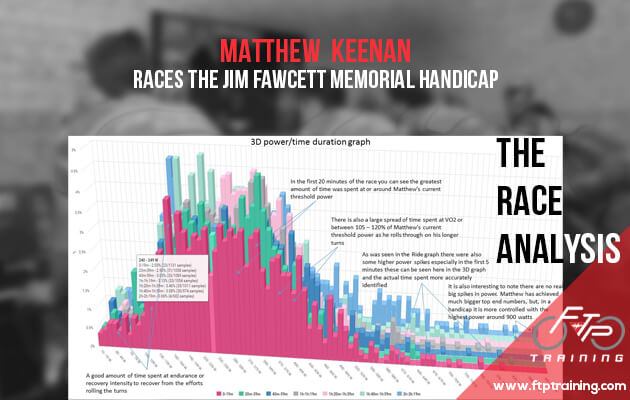
We are now going to look a little closer with more detail into the Ride Graph specific lap data along with using Today’s Plan 3D power/time Distribution Graph. Using both of these graphs together we can really see how and when things occurred in the race and understand when the major efforts were completed and if they were unleashed at the right time in the race to get the job done.

After just over 20 minutes of racing, Matthew’s group hit the first of three laps of the course. I have grouped the three laps Ride Graphs on the next page to demonstrate the similarity in the data. As mentioned above the handicap race sees a rider produce a more controlled effort until the bunches come together and the real racing starts. This can be observed in the similar data until the last lap and the final effort to the line.


We will look at the final climb in a little more detail to see the main efforts required to try and go with the scratch riders and vie for the win.

You can see that the final climb effort is made up of six efforts between 15 seconds and 1-minute-long. After burning a few too many matches throughout the race Matthew was able to go with the first few accelerations, but had nothing left for the final sprint. Matthew finished a very creditable 9th place on the day, having been training for eight weeks and on average seven hours a week. It is clear that with the right training great things can be achieved in a short period of time. This might not be enough to beat the A Grade riders, but it is possible to be competitive and be in there with a shout at the end of a solid handicap.
When looked at using the 3D power/time duration graph even more detail can be seen. The 3D graph allows us to be able to look at how much time was spent at a certain power output within a specified time duration. For this example, I have grouped the power into 10 watt bins and each coloured row represents a 20-minute segment of the race. As I peel away the layers more and more insight is given into what and how things happened in the race.
0 – 19 minutes the start of the race.

20 – 39 minutes as the race settles down

40 – 59 minutes Matthew has an easier 20-minute segment shown by a greater amount of time spent between 170 – 280 watts. There is a more even distribution of power associated with a handicap race.

1h – 1h:19 minutes Matthew’s group catch a slower group in front and put the hammer down to drop any potential passengers.

1h:20 – 1h:39 minutes the pressure is still on as the scratch riders are bearing down on the group.

1h:40 – 1h:59 minutes and the catch has occurred, it is now all about hanging in and saving energy where possible to be there at the finish and in with a chance of a result.

2h – 2h:19 minutes, it’s on and Matthew attacks to go across to Morgan Smith on a gravel sector – uses some energy that may leave him not able to respond on the final climb. Matthew had already assessed the riders and figured he had a better chance getting a small gap with another rider before the final climb to the finish so gave it a good crack. In the end they were pulled back and hit the climb to the finish with the bunch to contest the sprint.

So there you have it, the race broken down into laps and also 20 minute segments of data to reveal the true distribution of power and just what is needed to race a handicap.
The full data breakdown when looking at speed, distance and all the usual data metrics can be seen in the Laps tab – here I have created all the laps for an easy view of the data. You can have a good look and see if you have the watts to make it to the end of your next handicap and be in with a shout of winning.

In the end, Matthew didn’t quite have it in the legs to go for the win, but he was there to contest the finish. The ever popular handicap will always be a tough race, especially for the back markers who have to catch up a large chunk of time and for the groups that get caught. The effort to catch the front groups can be an equaliser for some and allow the lower grade riders the chance to get a win and the bragging rights associated with it.
Cheers,
Fenz


