A large proportion of athletes with power meters view their unit like a random number generator… the numbers tick over but that’s as far as the analysis goes. By the end of this article I am hoping that you will have gained an understanding of the power of power.
FOR THE PURPOSES OF this articles I will be utilising the Today’s Plan platform as this is what I am most familiar with, however, as mentioned previously a variety of platforms for this kind of analysis exist each with their own features and benefits. Choosing the right platform for you is a topic for another article.Analysis of the data provided by a power meter can be broken down into three main categories.
- Individual file analysis
- Multiple file comparison
- Data trends
What I don’t want this article to be is a glossary of terms as these are easy to “google”. Instead I will focus on the nitty gritty of a file and see some advanced detail.
INDIVIDUAL FILE ANALYSIS
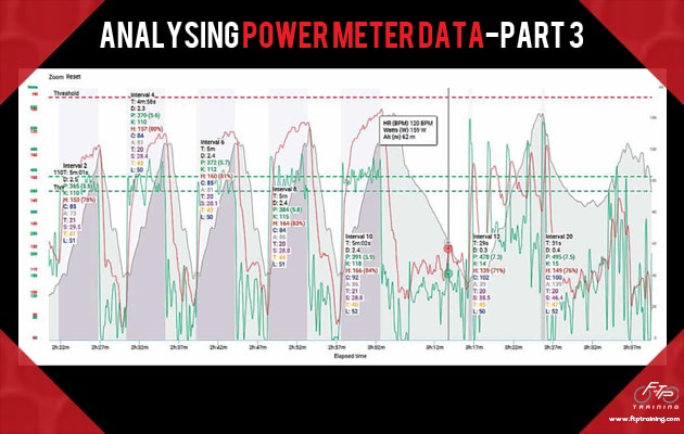
I have chosen to focus my attention on a training session completed by one of my athletes. It involved a series of 5 x 5 minute and 5 x 30 second efforts. The 5 minute efforts were prescribed at 105-110% of FTP and the 30 second efforts were full gas.
RIDE GRAPH:
The first graph to look at is the Ride Graph as this displays a large variety of information. In the example below I have cleaned it up to highlight the intervals completed so that it displays power in green and heart rate in red. The top dotted red line is threshold heart rate, and the dotted green lines are FTP and 110% of FTP. The shaded grey area is the altitude profile.
On the Ride Graph we can see the distinct variations between intervals and recovery power outputs (solid green line). The recovery power is 1/5th of the interval power. We can also use this graph to highlight the progression in powers over the 5×5 minute intervals with each subsequent interval being slightly higher than the last by an average of 5w each interval with the final interval averaging 110% of FTP. Looking deeper we can compare the heart rate and power of the final 5 minute interval (average power of 391w and average HR of 166 and max HR of 181). From historical data with this rider I know his maximum HR achieved in the last 6 weeks has been 193 bpm. So we can safely assume that whilst 391w is a solid effort it is significantly lower than what we could expect from the athlete in question if he was to have gone all out on these efforts.
 - Analysing power meter data 1")
ZONE DISTRIBUTION:
Comparing heart rate and power zone distribution, firstly let’s look at the heart rate distributions. Recovery = 63%, Endurance 26%, Tempo 7% and Threshold only 4% and from our previous analysis of the Ride Graph we are aware that the peak heart rate was actually below threshold. On the other hand, our power zone distributions are Recovery 63%, Endurance 15%, Tempo 5.5%, Threshold 7%, VO2 7% and Anaerobic 2.5%.
 - Analysing power meter data 2")
SO WHAT DOES THE DIFFERENCE IN DISTRIBUTION TELL US?
Primarily it highlights the limitations of training via heart rate alone, if we just look at the heart rate zone distribution we fail to see approximately 12% of the workout which was completed above FTP. Power zones distributions provide a greater detail about the intensity distribution of the ride. This is specifically true for the 30second efforts which are almost completely missed from a heart rate perspective
PEAK POWER CURVE:
The next graph that I would like to highlight is the peak power curve. This graph displays the peak power numbers achieved on this ride vs the peak power numbers achieved in the last six weeks. We can see that the gap between the two lines is close over a wide range of time frames and in particular the 5 minute period. Though as we expected from the heart rates he was still a fair way from a peak power. Of particular note we can see a power difference of 250w between todays and the 6 week peak 30s effort. As can be seen on the graph it is possible to toggle on and off a variety of time frames for this analysis
 - Analysing power meter data 3")
MULTI FILE ANALYSIS:
This feature allows us to compare rides and intervals that were completed on two different days. The Multi File Analysis chart shows two separate training session files overlaid for comparison. Following on from our previous example of the 5 minute intervals I am going to compare the intervals from the ride above with another set of 5 minute intervals completed in late December in the lead up to the national championships. The first session is of 4×5 minute intervals completed late December, it is easy to see that all four of these intervals were completed well above 110% FTP. With interval 1 and 3 a 30 second high intensity effort was completed at the start of the interval and on 2 and4 this was completed at the end. We can also see that on 3 out of 4 intervals his heart rate reached above threshold.
The second session shows the more recently completed intervals. We can see that the vast majority of time was spent below 110% of FTP and that heart rate peaked at 175 bpm which is well below threshold.
Finally, to highlight the more recently completed intervals, we can see that the vast majority of time was spent below 110% of FTP and that heart rate peaked at 175 bpm which is well below threshold. To be fair to the rider in question I would like to highlight that the training prescription of these intervals was slightly different. The December intervals were completed as all out efforts whilst the more recent efforts were set to a specific percentage of FTP. The reason for controlling the more recent efforts was around limiting rider fatigue as we are currently in a transition period between heavy racing blocks and going to deep could be detrimental to future performance.
 - Analysing power meter data 4")
DATA TRENDS
Looking at long term trends in training is a powerful way to inform decisions in regards to training and racing. I have chosen three of my favourite charts to look at which will change the way you view your training.
PERFORMANCE MANAGEMENT CHART:
The performance management chart (PMC) was originally devised by Hunter Allen and Andy Coggan as a way to track training load. It is built on around the concept of Training Stress Score (TSS) and the way that this accumulates as training increases. The PMC which you can see below is from an athlete of mine on Training Peaks I have chosen to present you this chart from Training Peaks as a nod in the direction of Allen and Coggan who have been pioneers in the development of cycling power analytics.
 - Analysing power meter data 5")
TERMINOLOGY:
Below are some terms to help put the performance management chart into context.
TRAINING STRESS SCORE (TSS): Is a numerical indicator of how hard a workout is, it is calculated off time, normalized power, intensity factor and FTP. In the above chart TSS is the red dots, with each completed ride being represented by a single dot.
CHRONIC TRAINING LOAD (CTL): Otherwise known as fitness CTL is the 42 day exponentially weighted average of your TSS. In the chart above it can be seen as the solid blue line.
ACUTE TRAINING LOAD (ATL): ATL is calculated in a similar way to CTL but instead of a 42 day average it is only aseven day average. It is represented by the solid pink line on the graph.
TRAINING STRESS BALANCE (TSB): This number is calculated by subtracting ATL from CTL. It allows us to determine an athlete’s ‘Form’ by comparing the last weeks training to the previous six weeks. It is represented by the orange line on the graph. A negative TSB would mean that the last week has been harder than the previous six weeks and we would expect an athlete to be relatively fatigued.
When we look at closely at the graph above we can see how this athlete’s CTL has risen over the last 6 months, we can also see that there were two periods of very minimal training due to work travel commitments in the second half of 2015 represented by the straight downward sloping of the blue CTL line. We can also see that since the beginning of 2016 there has been very consistent training resulting in an almost continuous upward trend in CTL. From an ATL perspective the stand outpoint is the spike in mid-January at the end of a training camp which resulted in a peak ATL of 118.
Apart from this peak and especially since then we can see that ATL is actually quite stable which highlights the consistency of this athletes training. Looking at TSB we can see that it dropped down to -50 at the end of the January training camp but consistently hovers between -5 and -15.
PEAK POWER BUBBLE GRAPH:
This graph looks at power output vs time and highlights the peak power outputs over a variety of time frames from five seconds through to 60 minutes and plots them according to the date they were achieved. The settings on this graph can be adjusted to select certain time periods or to include all historical data. The peak power graph allows a coach tor athlete to identify areas of improvement and see over which timeframes a rider has been improving recently.
 - Analysing power meter data 6")
RIDER INTENSITY FACTOR:
By looking at Intensity Factor we can see the way that the intensity of training and racing varies over time. The rider in question is completing quite large training volumes and rarely rides less than a couple of hours at a time. As such we can see that the columns which represent average intensity factor by month sit roughly around 0.6 this is significantly lower than we might expect of an athlete with less time available to train. The curved line represents the peak intensity factors achieved. Of particular note in the example graph would be the distinct build in average intensity in the lead up to the January national championships were we see a month by month increase through, OCT-NOV-DEC. In general terms we would expect that the larger the total volume of training completed by an athlete the lower the average intensity will be.
For those people who are interested in utilising power then I hope this article has been informative in highlighting some of the many benefits that can be garnered from looking at your data once you hop off the bike. Understanding power data can be daunting at first and the wide variety of graphs and charts can be confusing. If you need further guidance in this area, then there is a wealth of knowledge available through the numerous coaches in the Australian cycling community.
If you have made it all the way through to the end of this article, then I thank you. With any luck this article and the previous two in the series have sparked your interest in the usage of power meters for guiding and enhancing your training and racing
 - Analysing power meter data 7")
(this article originally appeared in Bicycling Australia Magazine)


